

The project itself :
Project Overview
SeeTrue’s platform connects directly to existing X‑ray and CT scanners, adding an AI layer that flags suspicious items, automates parts of the screening flow, and feeds analytics back to operations teams. The design challenge is to support very fast decisions in stressful environments, while still providing enough context and transparency so operators trust the AI and can override or investigate when needed.
Problem:
Security screening teams must inspect huge volumes of bags and cargo with very low tolerance for mistakes, often using legacy interfaces that are slow, cluttered, and not optimized for AI‑assisted workflows. Operators struggle to balance detection accuracy with throughput, and small usability issues—unclear alerts, poor layouts, or inconsistent states—can directly impact safety and passenger experience.
Goal:
The main goal of the design work with SeeTrue is to create AI‑assisted screening interfaces that let operators work faster and more confidently without compromising safety.
By clarifying alerts, simplifying review flows, and giving supervisors better visibility into lanes and performance, the product aims to increase throughput, reduce manual workload, and strengthen trust in the AI across all levels of the operation.
My role:
Worked as the dedicated UX/UI designer for SeeTrue, collaborating with product, R&D, and field teams to evolve the platform over multiple generations. Responsible for defining interaction patterns, visual language, and data presentation across operator consoles, monitoring tools, and analytics dashboards used by internal and external customers.
Responsibilities:
Conducting research
Mapped user journeys and flows.
Digital wireframing
Designed wireframes and prototypes
Research
Research activities included interviews and observation sessions with security operators, supervisors, and integrators at airports and security sites that have SeeTrue deployed. These sessions revealed how screeners actually interact with X‑ray images, what slows them down, and how they perceive AI suggestions, helping to refine layouts, shortcut patterns, and alert behaviors.
Pain Points
Overloaded and noisy alerts
Operators face long lists of alerts with similar visual weight, making it hard to see which bags or lanes need attention first.
This overload increases cognitive strain, slows down decisions, and can cause important threats to be buried among low‑risk events.
Low transparency of AI decisions
When the interface only shows a “threat detected” label without clear visual explanations, operators are unsure why the AI flagged a specific area.
The lack of context reduces trust in the system and forces screeners to spend extra time double‑checking images instead of moving efficiently through the queue.
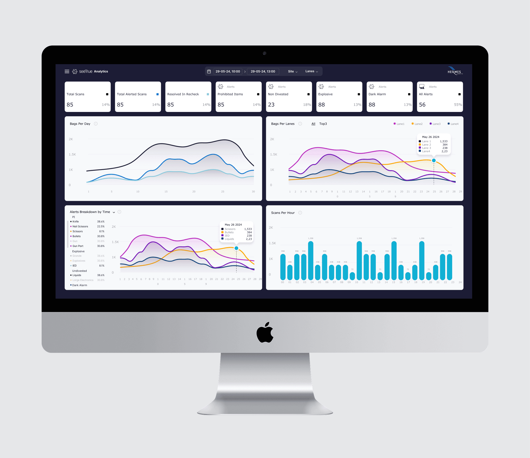
Limited real time oversight for supervisors
Supervisors often lack a unified dashboard that shows status across lanes, reject rates, and operator workload in real time.
Without this visibility, it is difficult to balance staffing, adjust thresholds, or quickly spot bottlenecks, which directly impacts throughput and passenger experience
User Journey Map
The journey starts with bags or cargo entering a lane where SeeTrue’s AI analyzes X‑ray/ CT images in real time and flags potential threats. Operators then review highlighted areas, make a decision (clear, rescreen, or manual check), and the system feeds outcomes into analytics views for supervisors and SeeTrue’s own teams to improve models and configurations.
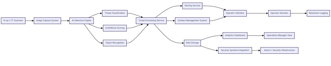
The project schematically :
Starting the Design
Starting the design for SeeTrue began with turning real security‑lane observations into a clear product structure. All findings from on‑site shadowing, interviews with screeners and supervisors, and regulatory constraints were clustered into concrete scenarios such as handling AI alerts, reviewing suspicious bags, managing queues, and supervising multiple lanes. These scenarios defined the initial screen list and user roles, so that every step a screener, analyst, or manager had to complete was mapped before any pixels were pushed.
From there, low‑fidelity flows and wireframes were created to explore different layouts for the core tasks: how the X‑ray image and AI highlights appear, how secondary information like bag details and passenger data is surfaced, and how decisions and escalations are recorded under time pressure. These early explorations focused on clarity, response time, and operator confidence, allowing quick validation with the SeeTrue team and airport stakeholders before committing to high‑fidelity UI, visual language, and design system work.
Digital Wireframes

The clear version :
Design
Different UI directions were explored, from dark, image‑first layouts optimized for long screening shifts to more analytical dashboards for supervisors that emphasize trends, reject rates, and lane performance. The final system combines these perspectives, using a consistent design system so operator stations, configuration tools, and analytics views feel like one cohesive platform.


The project schematically :
Outcome
The evolving UX and UI help SeeTrue customers reduce manual screening time, handle higher passenger volumes, and maintain or improve detection performance. Clearer alerts, streamlined flows, and better visibility into system status support safer decisions under pressure and strengthen trust in SeeTrue’s AI‑powered screening platform.


